I was 10 years old when my family moved from Melbourne to Perth. And when I say Melbourne, it was actually a little country town in Gippsland. Very little. So moving to Perth felt like we were moving to New York. The suburb that became my new home was large enough to accommodate two Butchers. And although I’m presuming the product was very similar, their shop fronts were displayed very differently. The busiest Butcher, Tom, had gone to great lengths to stand out from his competitor. His visual merchandising involved bright green, plastic parsley littered intermittently through the lamb chops. Fluorescent pink triangle bunting adorned the front door. And in case you weren’t sure what, exactly, he was selling, the shop window was a canvas to cute and colourful artwork of baby lambs, cows and pigs. Pre-slaughter, obviously.
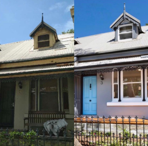
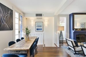
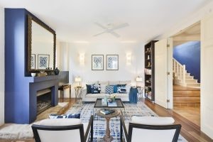
The use of bold colour as a visual device worked well to attract the local family market. The proof was evident by the size of Tom’s Ute. It was big enough to comfortably accommodate three large Angus cattle in the back seat, if required. And the use of colour to stand out from our competitors is just as effective in today’s market. Particularly when it comes to presenting your home for sale. In a sea of neutral taupes and 50 shades of Shale Grey, a freshly painted, bright front door can be enough to give you cut-through. This Birchgrove cottage is a great example. The invisibility of its dreary exterior was easily resolved with a tidy up of the garden and a splash of blue paint. The impact of colour to the property’s noticeability was absolutely a contributor to its seven short days on the market.
